.png)
George Little

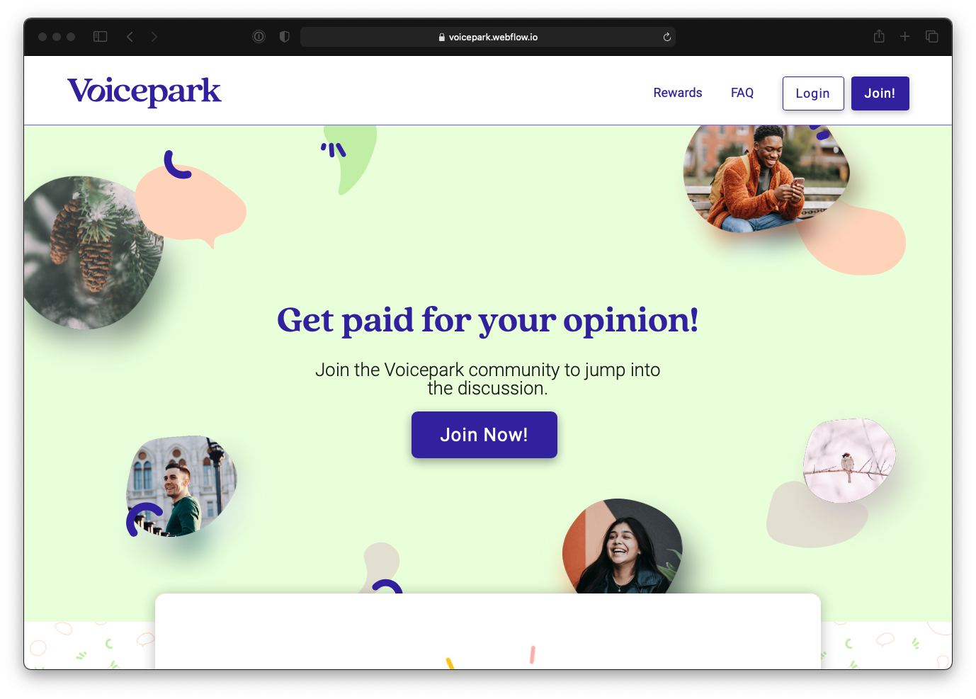
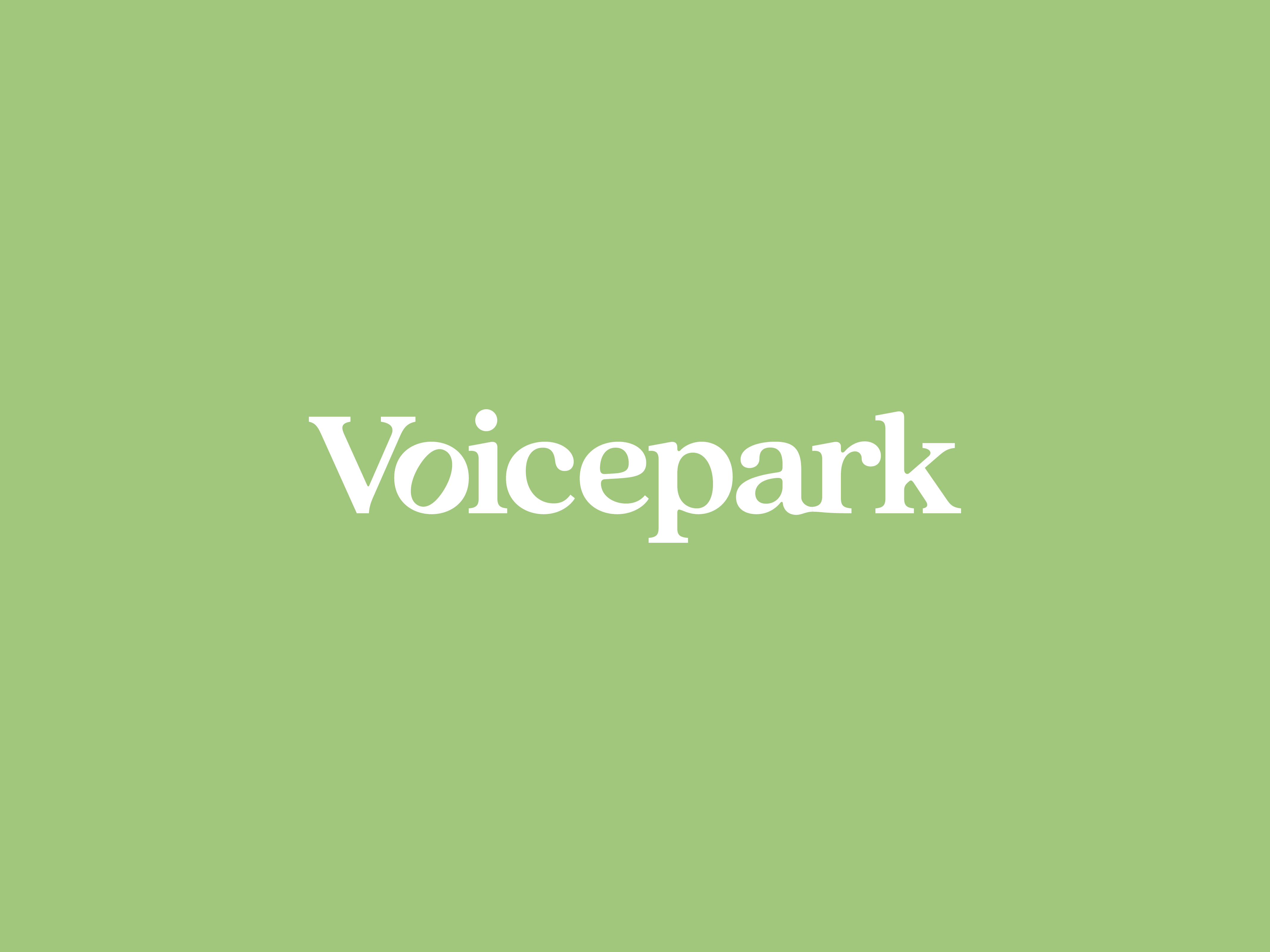
Its 2024. Forms are dead. Get started here.
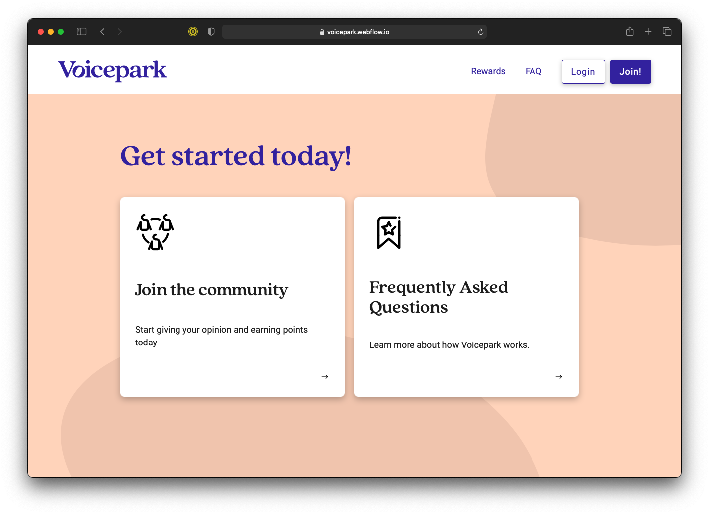
Voicepark marks a significant milestone in Remesh's strategic expansion, serving as the gateway to a novel research sample community. Traditional sample communities, where individuals participate in studies for incentives, often feature overly vibrant and crowded designs. In contrast, Remesh aimed to cultivate a brand that exudes sophistication while maintaining a connection to its roots.
The brand name, voicepark, is a thoughtful amalgamation of two concepts:
Voice - Every human has a voice, and each voice is unique.
Park - These are places for everyone; places for communities to enjoy together, places to meet and gather, and, most importantly, places for communities to hold space for conversation and discussion.
This nomenclature embodies the platform's dual purpose: fostering a space for meaningful conversations and emphasizing the value of each participant's contribution.
The project's challenge was crafting an identity that could both stand independently and complement the existing Remesh brand. The solution was a brand that resonates with Remesh's ethos yet introduces a distinct narrative, appealing to a broader audience while maintaining the core values of inclusivity and dialogue.
The typography was selected for two major reasons: firstly, its serif nature leaned toward an institutionalized look and feel that the overall initiative aimed for. Secondly, as a balance to the first point, it's soft and rounded, which help to make the institution feel more welcoming, and more communal. Quincy CF provided the perfect balance.