.png)
George Little

Its 2024. Forms are dead. Get started here.
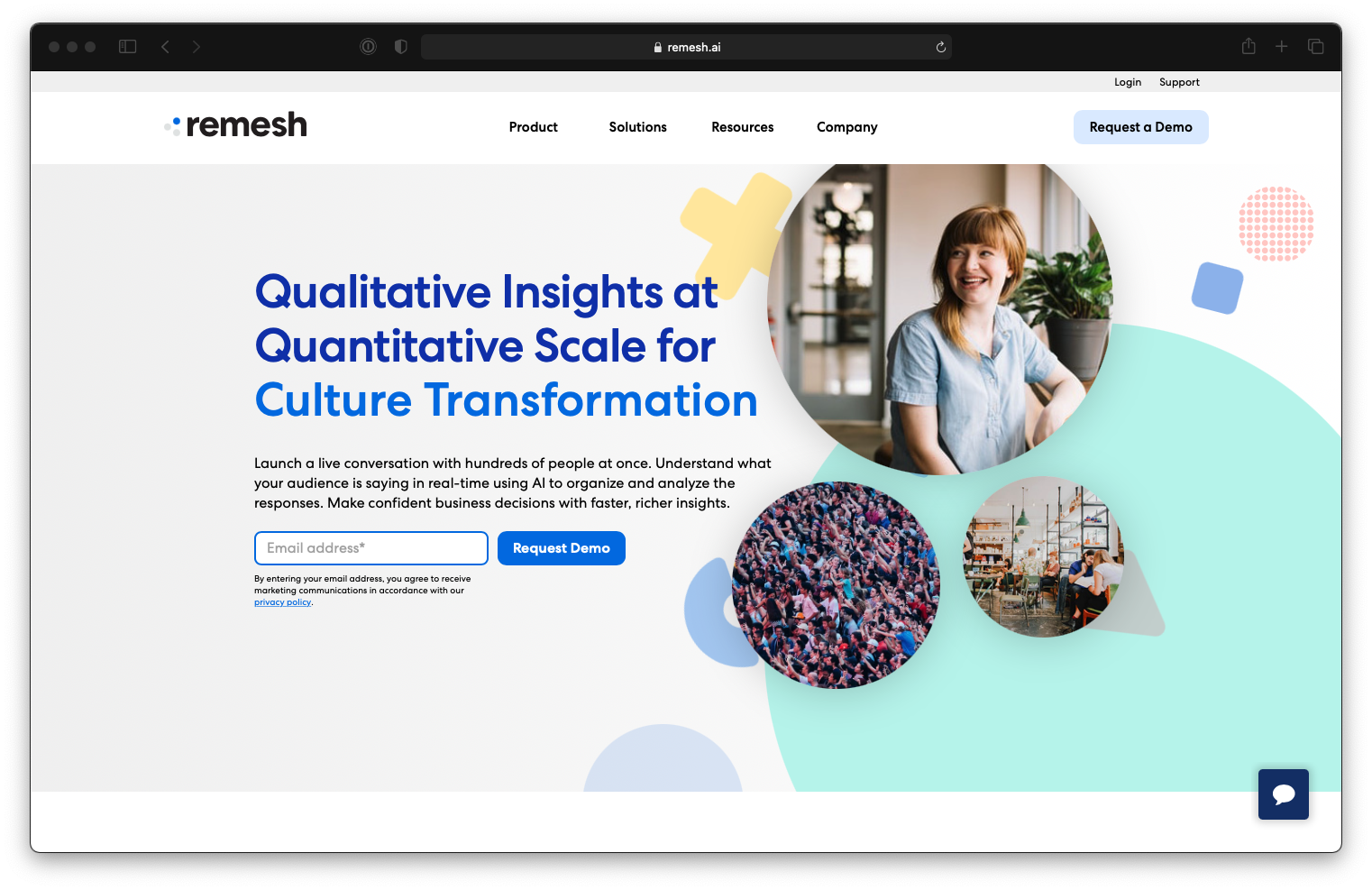
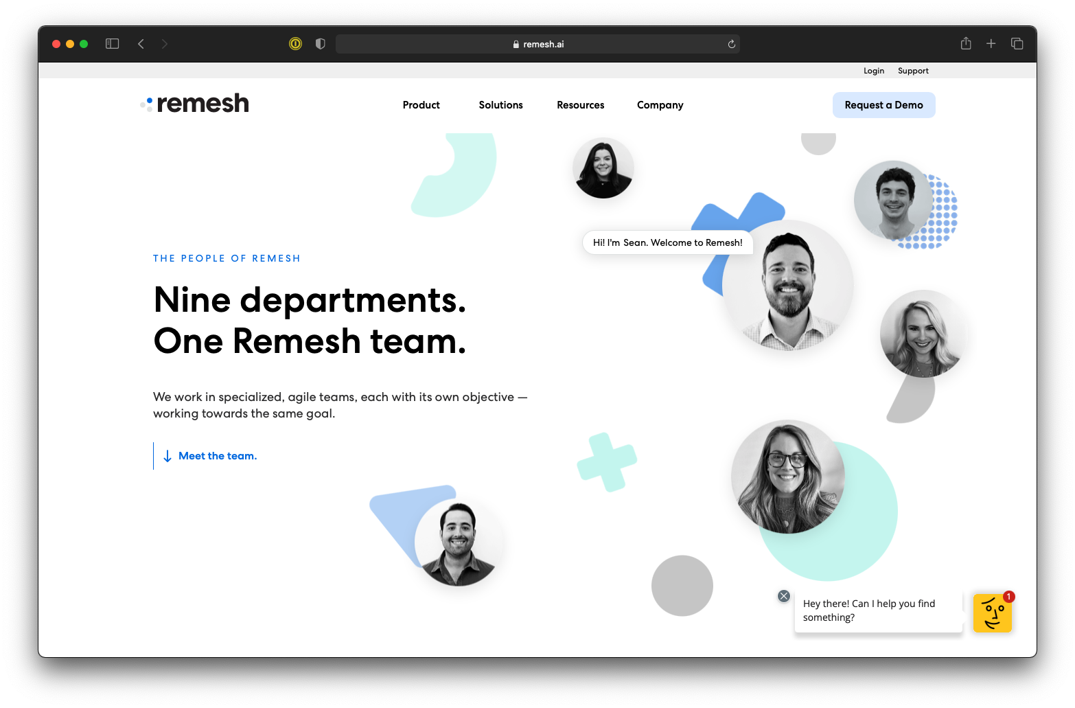
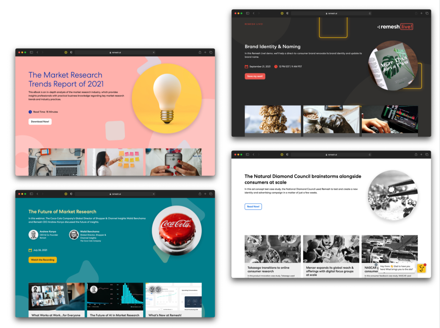
As Remesh continues its impressive growth trajectory, the brand's evolution becomes imperative to mirror the company's expanding scale and sophistication. Over the past three years, the Remesh brand maintained a consistent image that once perfectly encapsulated the company's essence in terms of scale and culture. However, with significant changes in the company's size, now boasting over 150 employees, and an esteemed clientele including giants like Nestle and the United Nations, a brand maturity was necessary to reflect the current stature of Remesh.
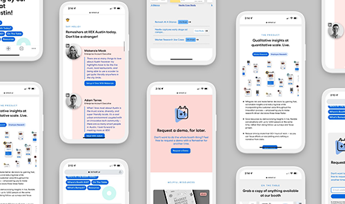
This brand transition, spanning over a year, encompassed a holistic overhaul, from sales decks and marketing materials to case-study designs, internal branding, demo videos, help docs, and the website. The strategy aimed for a seamless transition to the new brand standard without causing a disruptive impact, ensuring a smooth introduction to the updated identity once fully established. A critical aspect of this evolution was retaining the core logo and overall identity, capitalizing on the recognition already established in the marketplace.
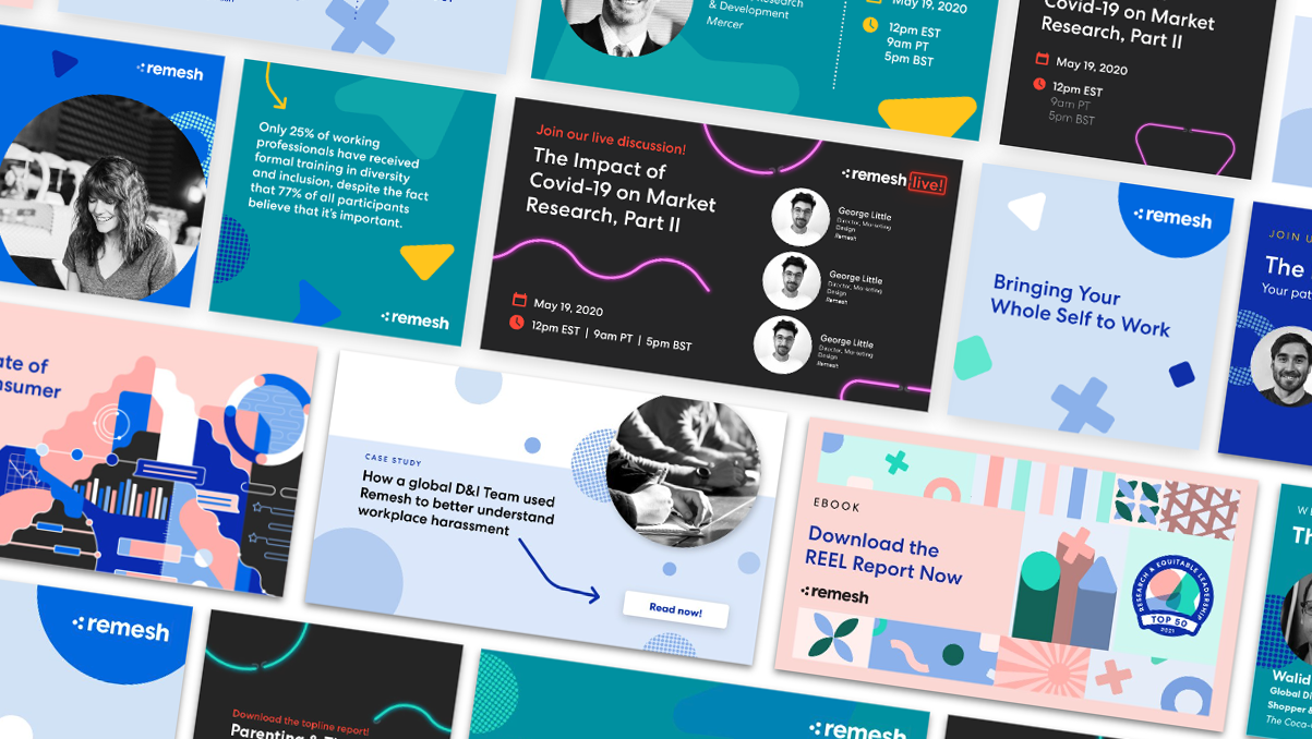
The refreshed graphic identity now portrays a cleaner, content-forward, and dynamic image, skillfully blending the original Remesh playfulness with sophisticated design elements. The transformation notably includes the innovative use of patterns, arrows, and floating shapes, achieving a familiar yet refined visual experience.


.png)
.jpeg)