.png)
George Little

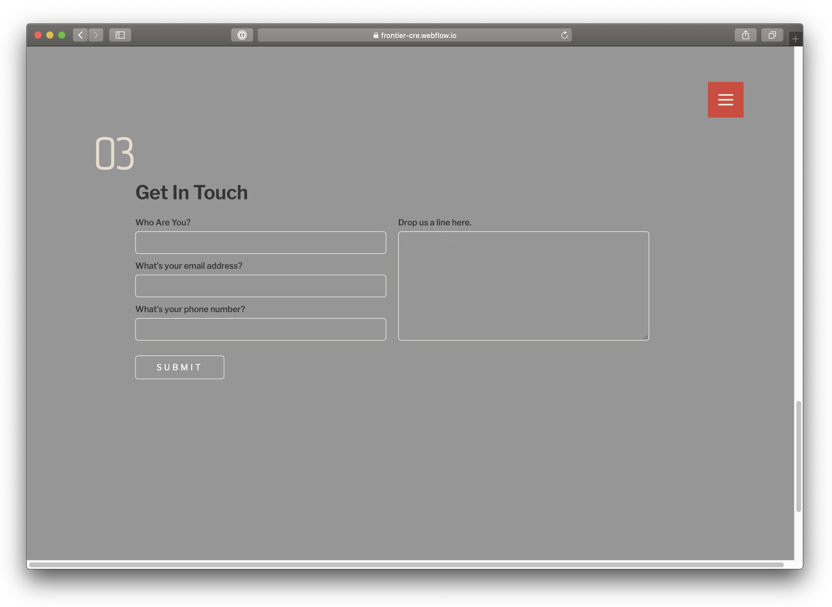
Its 2024. Forms are dead. Get started here.
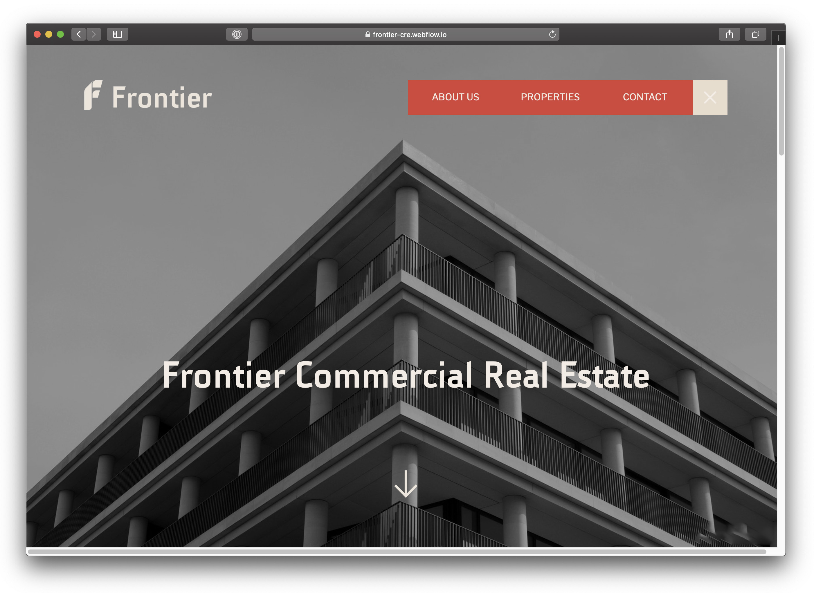
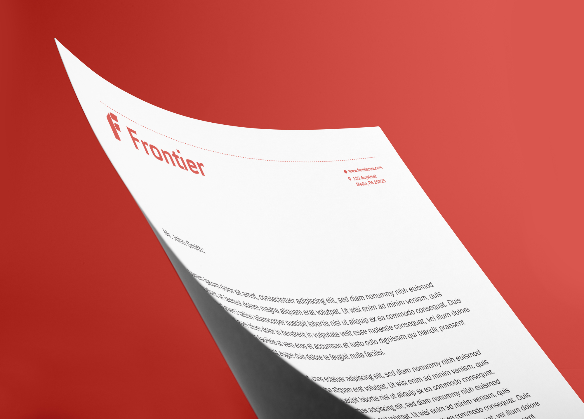
Frontier, a trailblazer in the commercial real estate sector, sought a brand identity that mirrors its sleek, contemporary ethos while exuding reliability and foresight. The challenge was to craft a graphic identity that not only stood out in the competitive market of leasing office and light-industrial spaces but also resonated with the company's target audience.
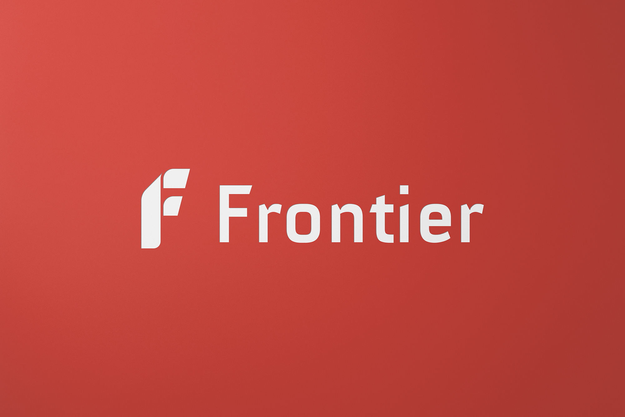
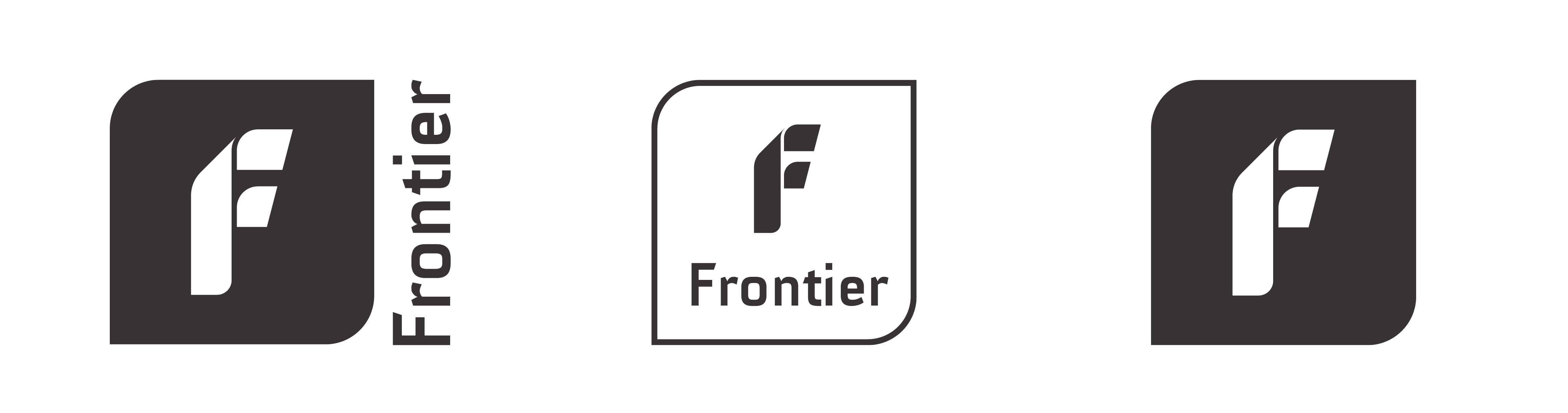
The cornerstone of Frontier's brand identity is its innovative logo, a masterful blend of typography and three-dimensional form. The 'F' in the logo plays a dual role—it can be perceived as a trio of flat shapes or as shadows cast by a vertically standing 'F,' as viewed from above. This clever design introduces depth and dimensionality, capturing the viewer's attention.
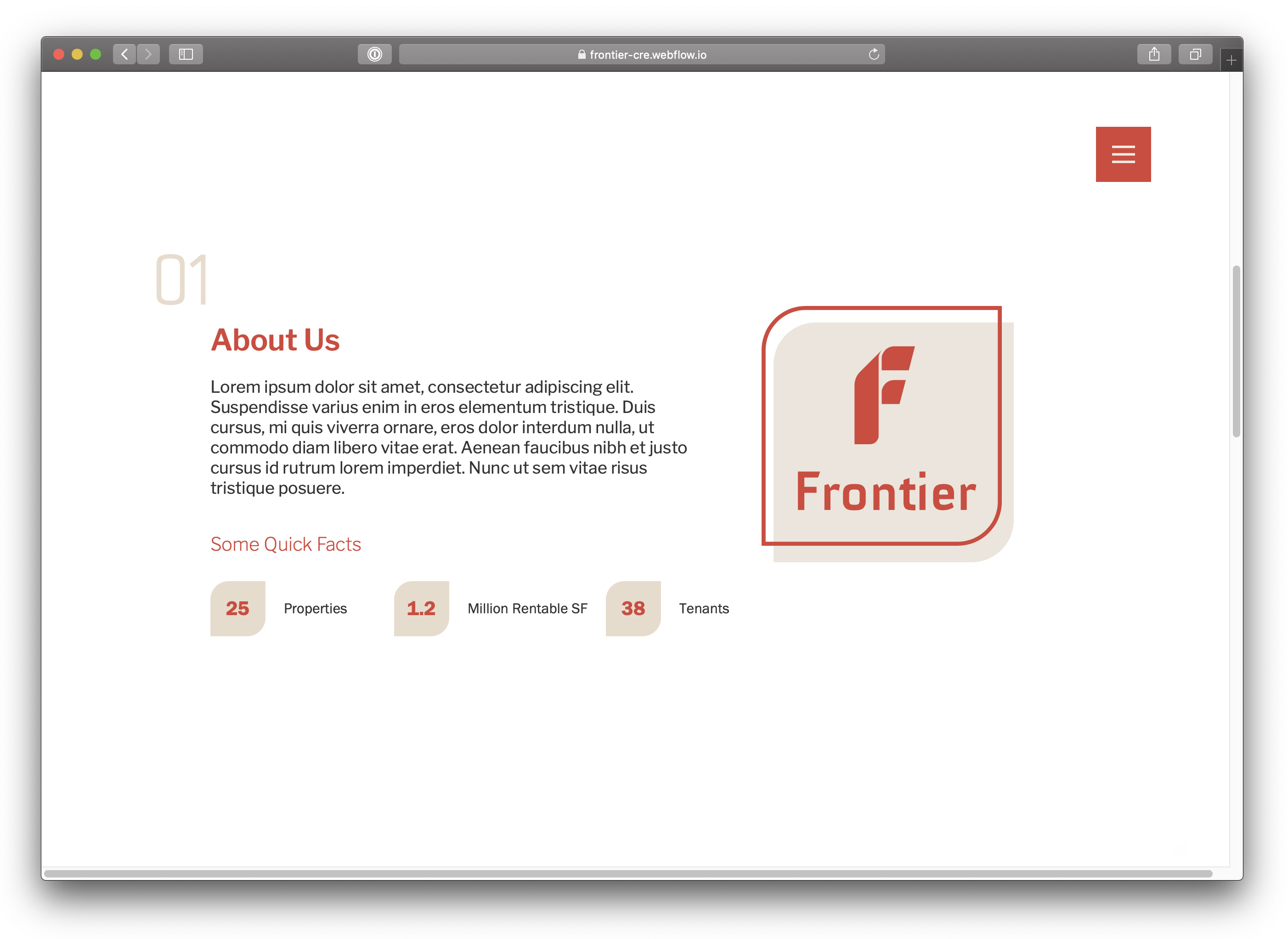
Accompanying the logo is the brand's name, 'Frontier,' rendered in the Centim font face, subtly modified to enhance legibility and aesthetic appeal. The logo adapts to various formats, from a traditional horizontal layout to several square configurations, offering versatility across different media. This adaptability is further emphasized by a distinctive branded shape—a square with two rounded corners—repeated throughout Frontier's visual language, creating a cohesive brand experience.
The color palette is anchored by a rich, muted red, providing a vibrant contrast to the neutral tans and greys that dominate the rest of the branding. This deliberate choice allows the red elements to pop, ensuring immediate brand recognition.
Centim is a narrow, stylized, contemporary font face. Its variating thickness and sharp terminations, make it distinctive, dynamic, and recognizable. Franklin Gothic is a professional, modern, and sophisticated font-face. It's excellent for large amount of copy since it's so easy on the eye. It comes in six weights, each offering a slightly unique tone. The font’s rigid structure gives it an intelligent persona.


.jpeg)